

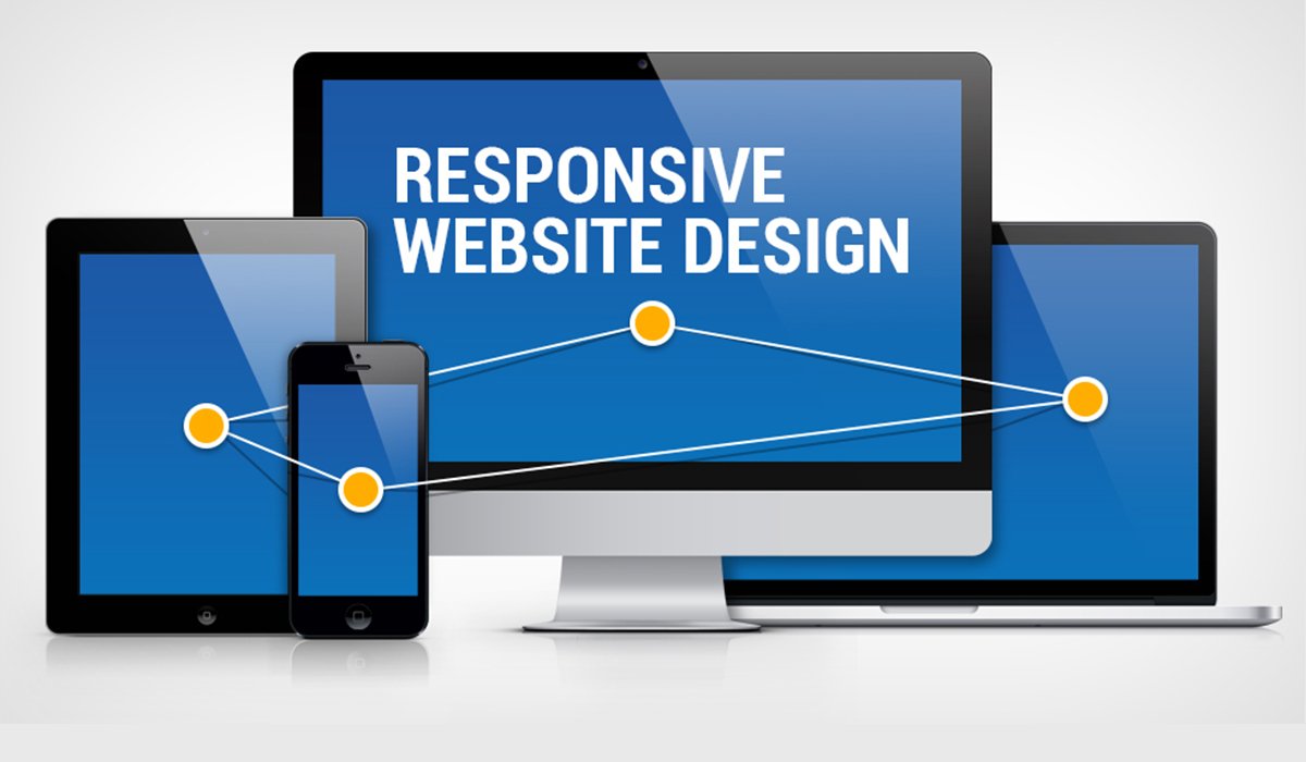
01 Oct Beautiful and Responsive Web Design
Web design is the process of creating websites. Most websites include a combination of HTML and CSS that defines how each page will appear in a browser. Beautiful and Responsive web design provides an optimal experience, easy reading and easy navigation with a minimum of resizing on different devices .
Responsive Website Design uses the following methods:
- Fluid grids, where elements are resized through the use of relative units, like percentages, versus absolute units, like standard measurements a
 nd pixels
 - Flexible images, which are also size in relative units
- CSS media queries, which allow a website to determine device type, screen size and browser capabilities, enabling the delivery of different style rules based on these characteristics
- Server-side components with media queries, which enable faster loading websites – even with slower cellular data speeds
